Buying-journey redesign · search to checkout
The Vault — Saved Cart
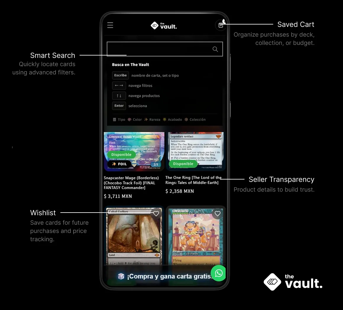
TCG buyers don't impulse-buy. They compare, wait, and come back. Nobody else in the category built a cart for that.
Every competitor in the category cleared a buyer's cart the moment they left. I built the one thing none of them had — a cart The Vault remembers — and rebuilt checkout around it.
Tools · Figma · FigJam · Photoshop · Shopify

The project
A cart that remembers you, in a category where nothing does
This is the feature-level case study behind The Vault’s storefront redesign — the buying journey specifically: search through checkout, and the one gap the whole category shared until this shipped.
- Role
- Sr. Product Designer
- Scope
- Search, product, cart, checkout
- Timeline
- Dec 2025 – Jun 2026
- Context
- The Vault Co · in-house since 2023
- Search
- Product
- Save cart
- Add to cart
- Checkout
- Confirmation
Context
What the buyer needed, against what the business needed
Every decision below is argued from these two lists at once — a feature that served one and not the other didn’t ship.
What buyers were trying to do
Compare before committing
Price a card against other sellers, and against importing it from the US, before paying anyone.
Pick up a decision where they left it
A decklist is built over days or weeks. Losing the cart meant starting over.
Trust the seller before the money moves
Condition as described, seller accountable, a way to resolve it if something goes wrong.
Do all of it on a phone
Most of this audience shops on mobile — the surface that held up worst before this shipped.
What the business needed
Fewer abandoned carts
Every cleared cart was a comparison that had to restart on a competitor’s site instead of resuming on this one.
A shorter path from decision to payment
Once someone was ready to buy, every extra step was a chance to reconsider.
Checkout confidence, not just checkout speed
Cutting steps without addressing trust would move the drop-off, not remove it.
A feature the design system could carry
Whatever shipped had to extend the same tokens and components everywhere else The Vault runs.
Problem
Buyers don't decide in one visit — the product assumed they did
Collectors comparing cards across sellers hit the same wall everywhere: no way to save a cart and come back to it. TCG buyers don’t impulse-buy — they build a decklist over days or weeks, compare prices across sellers, wait for payday or for a specific card to hit the market. Every competitor forced an immediate decision or the cart was gone.
Layer a category-wide trust problem on top — unverified sellers, no way to confirm a card’s condition before it ships — and an information gap — no real-time pricing, no rarity context — and the pattern across every existing platform was the same: built to move inventory, not to help someone shop.
Design process
Turning a market gap into a spec
- 01
Objectives & scope
The questions every later decision had to answer: how buyers search, why carts get abandoned, what it takes to trust a stranger with a payment.
- 02
Competitive & heuristic benchmarking
TCGPlayer, Cardmarket and Hobby Mart on transaction features; Card Kingdom, Star City Games, Yellow Rabbit, MTG Wolf and MTG Mexico as outside reference points.
- 03
Pain-point synthesis
Four recurring breakdowns, ranked by how consistently they showed up across the research above.
- 04
Personas & empathy mapping
The player, the collector and the returning buyer — and what each one thinks, feels and does mid-purchase.
- 05
Design decisions
Persistent Saved Cart, deferred checkout information, transparent seller data — specified against the existing design system.
- 06
Success metrics
The Google Analytics + Shopify funnel this project is read against in Results.
Quantitative analysis
The funnel before this shipped
The diagnosis came from the same window later used to measure impact: the baseline behind every number in Results.
Qualitative analysis
Where it broke down
Trust & authenticity
Buyers pay strangers for items they cannot inspect and cannot confirm the condition of before it ships.
A cumbersome buying process
Too many decisions, too few steps, and a cart that clears the moment you leave.
A weak mobile experience
Where most of this audience actually shops, and where the old flow held up worst.
No point of comparison
Nothing on-platform told a buyer whether the price or the seller in front of them was actually good.
User persona
Who this shipped for
The Competitive Player
Builds a tournament decklist over several sessions, pricing each printing against multiple sellers before buying any of it. Needs a cart that survives closing the tab — the old one didn’t.
The Collector
Buys selectively and treats condition and seller accountability as non-negotiable. Will wait a week for a trusted seller or a better price rather than decide under pressure.
The Returning Buyer
Shops almost entirely on mobile, price-checks against importing from the US, and drops off the moment checkout asks for information before they’ve decided to buy.
Empathy map
What the buyer thinks and feels mid-purchase
Says
"Don’t lose my cart, I’m still deciding." "Tell me this is actually near mint before I pay."
Thinks
Would this be cheaper if I wait a week? Is this seller actually going to ship what’s pictured?
Does
Opens several seller tabs to compare the same card. Leaves a cart sitting open in a browser instead of trusting the platform to hold it.
Feels
Cautious about paying a stranger for something unseen. Frustrated rebuilding a comparison from memory after a cart disappears.
The decision
The gap nobody else closed: Saved Cart
The comparison behind that pain point was concrete. I ran a structured competitive analysis against TCGPlayer, Cardmarket and Hobby Mart across the features that actually decide whether someone buys: advanced search, wishlist, saved cart, multi-seller checkout, seller reputation. Three of the four matched each other almost feature-for-feature. All three shared one identical gap.
The decision: build Saved Cart as a first-class feature — not a session cart that clears on close, but a persistent one tied to the account, positioned as core to the journey rather than bolted on after checkout.
I validated the direction by benchmarking established players outside the direct competitive set — Card Kingdom and Star City Games internationally, Yellow Rabbit, MTG Wolf and MTG Mexico locally — rather than running it through user interviews first. That’s competitive and heuristic validation, not primary research, and it’s worth stating plainly rather than implying otherwise.
Checkout friction
Reducing friction where trust breaks down
Pain points from research pointed to a second, compounding problem: even when someone was ready to buy, checkout itself introduced doubt — unclear seller information, no order-tracking visibility, too many decisions crammed into too few steps. The strategy split this into two separate jobs rather than one generic “improve checkout” task: build confidence — transparent seller info, product detail, order tracking — and reduce friction — cut unnecessary steps and decisions.
Concretely: fewer steps overall, and the information a buyer needs to complete a purchase — instead of being requested up front — is deferred to the last step. The buyer moves toward the purchase first and only encounters the required specifics right before confirming, rather than being asked to commit information before they’ve committed to buying.
Wireframes
Structure before a single production pixel
Both screens from the sketches — the product page and the cart — taken to information architecture and flow before any visual design. The open questions at this stage were placement and hierarchy: where the save action sits, what a saved cart is inside the account, and what a buyer sees when they return to one.
- In stockNear MintSave to a cartAdd to cart
A first-class choice on the product page, not a step after checkout.
1 — Product page: the save action sits beside add-to-cart, so a comparison can start before any commitment.
- 12 cards6 cardsPrice drop3 cards+ New cart
A cart is something you keep, not an artifact of an abandoned checkout.
2 — Account: “Mis Carritos Guardados” sits alongside Wishlist — each cart named and countable.
- $ 844No longer avail.Price changedMove to cart
Deltas surfaced explicitly. Shipping and payment deferred to the final step.
3 — Cart detail: what changed while it was saved is shown up front; checkout information waits until the end.
High-fidelity
Everything the wireframe decided, in the product's language
The same three screens, taken to the product’s own visual system — pure black, Inter, mint green reserved for availability and value, amber for anything that changed while a cart sat saved. This is the version that went to engineering.
Magic: The Gathering
Wizard’s Lightning [Dominaria]
$ 15 MXN
Guárdala en un carrito con nombre para comparar sin comprometerte. Impuesto incluido; el envío se calcula al pagar.
3 carritos · $ 2,940 en total
‹ Carritos guardados
Mono-Red aggro
Guardado hace 6 días · 2 cambios desde entonces
Envío y método de pago se eligen en el último paso.
Design system
Carried by the same system, not a one-off
None of the decision above, or the friction work that followed it, survives contact with a real product without a system underneath it. Saved Cart and checkout run on the exact tokens documented in full in the ecosystem case study — built once, applied here first, and now reused everywhere else The Vault ships.
Black is the product. The canvas is pure black, so card art is the only saturated thing on screen — including inside the cart, where a product thumbnail should read before its price does.
- Canvas#000000The page ground. Card art carries the colour, the interface carries none.
- Card#0D0D0DLine items, product tiles, lifted by a #1F1F1F hairline.
- Input well#141414Fields, quantity steppers, and the payment-method selector.
- Raised#1A1A1AConfirmation dialogs and toasts.
The cart and checkout surfaces are built from the same four steps above black as the rest of the product — nothing here gets its own palette.
Consistency
The cart, the checkout and the storefront share the same components — nothing here was designed as a special case.
Accessibility
WCAG-aligned contrast, type sizing and touch targets — a checkout is the worst place to fail this.
Scalability
Built on semantic tokens, so the next feature extends the system instead of forking it.
What shipped
From those frames to the live product
Engineering shipped it close to the design, with the drift any handoff has: the type is Assistant rather than Inter, and the standalone Guardar button was consolidated into the persistent account cart instead of sitting beside Agregar. The structure held. The cart runs one component set across breakpoints — no separate desktop build, no simplified mobile fallback. Desktop lays out every line item and the full cost breakdown in one view; mobile surfaces the total and Pagar pedido as a sticky bar under the product list, so the buyer can act without scrolling to the bottom of a long page first.
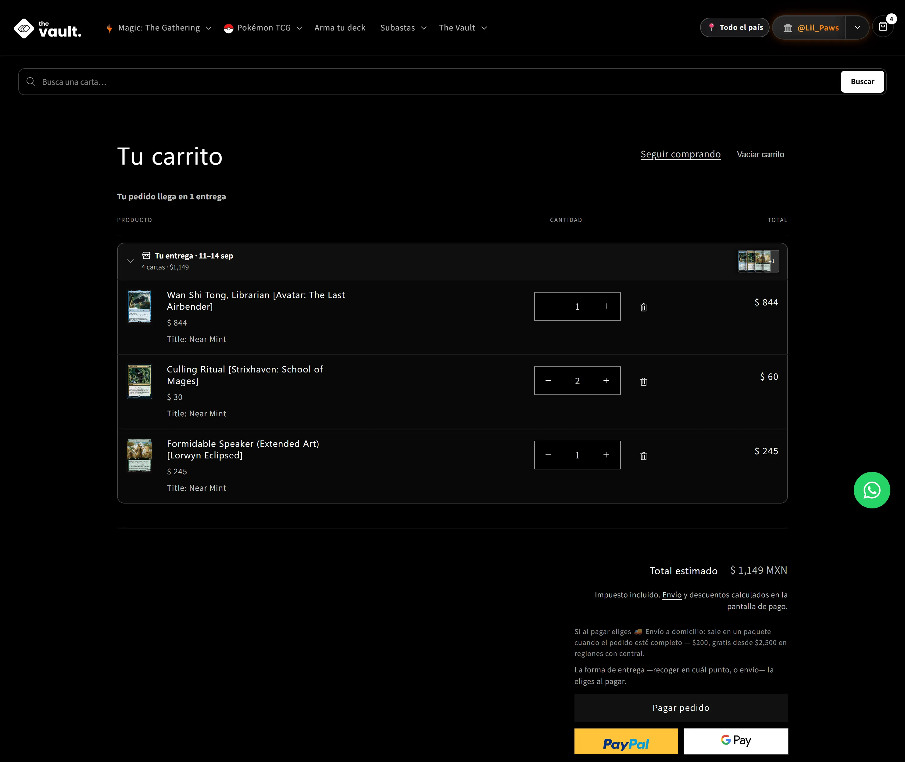
Desktop — full line-item detail, nothing collapsed
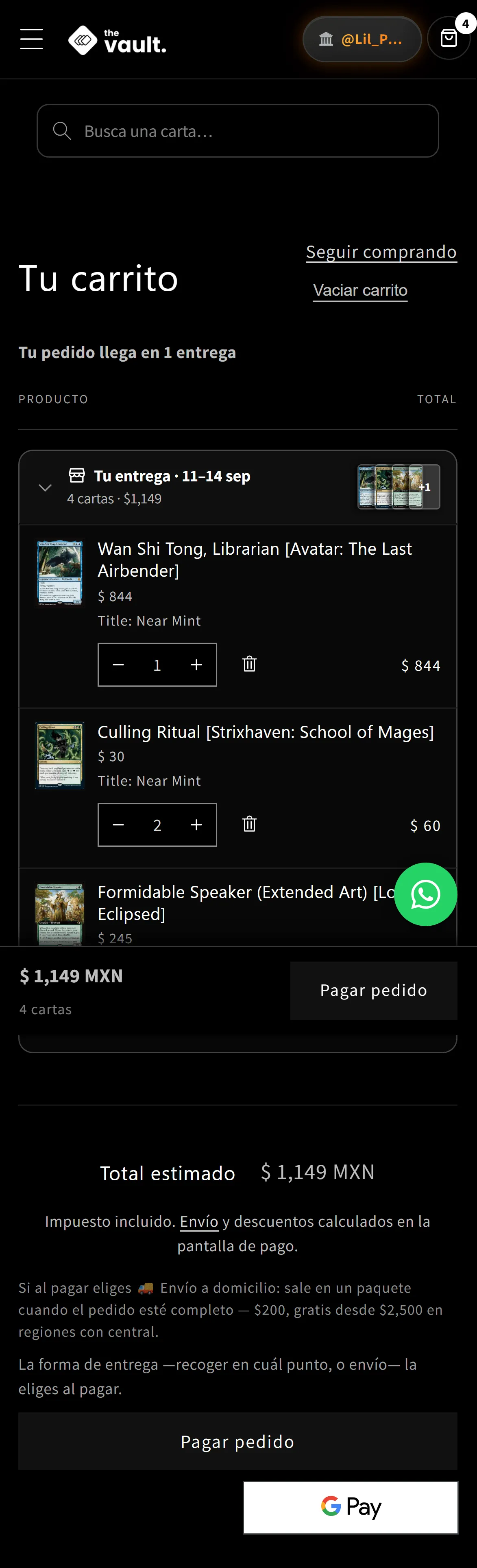
Mobile — a sticky summary so the buyer can act without scrolling further
Results
Google Analytics + Shopify · Dec 28 2025 – Jan 28 2026 vs May 29 – Jun 28 2026
- Payment screen → purchase+85%34%63%
- Sessions completing checkout+392%1259
- Cart → payment screen−8%50%46%
Same window as the ecosystem case study's Results. This is the step this project owns directly.
Reflection
The last step, not the top of the funnel
The landing-page redesign tripled traffic in the same window, which makes it tempting to credit the whole funnel to discovery. The stage conversions say otherwise: the share of sessions adding a card to cart and reaching the payment screen barely moved. What changed was the last few seconds — of the people who reached payment, 34% completed checkout before this shipped, 63% after.
That’s the fingerprint of deferring required information to the last step instead of the first. It didn’t pull more people into the funnel or get more of them to add a card to cart — it kept the people already close to buying from dropping off at the finish line.
Two honest limits. The baseline period recorded twelve completed checkouts — small enough that a handful of transactions swings the percentage hard, so the direction is trustworthy and the precision isn’t. And because the landing page and this redesign shipped in the same window, I can tell you the last step tightened, not with certainty how much of that belongs to Saved Cart versus the checkout-flow changes specifically. Per-surface attribution is the first thing I specified on the next feature.
Closing
What this project was really about
The brief looked like a feature request — add a saved cart. What it actually required was treating the buying journey as a sequence with a shape, not a page with a button on it: search that assumes intent spans multiple visits, a cart built to be left and returned to, and a checkout that asks for information only once the buyer has already decided.
That’s also why it reads as one product with the storefront redesign rather than a bolt-on: same system, same voice, same account layer — a buying journey that finally matched how this category’s buyers actually shop.